
Kompetisi Infografis Statistika (KIS) was one of the main events in the Ajang Pengenalan Statistika dan Festival Data (ANAVA) #20 organized by Himpunan Mahasiswa Statistika FMIPA Universitas Gadjah Mada. This year, ANAVA carried the grand theme ROLL THE DICE: Research, Observe, and Link Data to Inspire Creative Exploration highlighting the importance of research, observation, and logical data processing. Specifically for KIS, the theme was SCRABBLE: Show Creativity, Reveal Analysis, Build Logic, and Express Evidence emphasizing the balance between creative visualization and solid analytical thinking.
Registration was open from December 6, 2025 to January 7, 2026 with two payment schemes, which are Early Bird and Regular. The submission period ran from December 7, 2025 until January 11, 2026 at 10 PM WIB. In the preliminary round, participants were required to submit three main components: an infographic in .png format (A3 size, 300 ppi), a 150–300 word description in .pdf format, and a signed originality statement. All works had to align with the theme STEM for National Innovation through Data Visualization with subtopics including Renewable Energy, Digital Economy Transformation, Smart Agriculture, Biotechnology and Healthcare, and Sustainable Infrastructure.
Our team chose Smart Agriculture as our subtheme, as it closely relates to data-driven innovation. We developed a machine learning approach that combined LSTM–XGBoost with DP-GMM clustering. LSTM helped us capture sequential and temporal patterns in the data, while XGBoost improved predictive performance through its adaptive boosting mechanism. Meanwhile, DP-GMM allowed us to explore data segmentation without setting a fixed number of clusters from the beginning. This combination enabled us to build an analysis that was not only accurate but also exploratory in uncovering hidden patterns.
The preliminary round was evaluated based on several criteria, including originality, relevance to the theme, visual appeal and data visualization, quality of analysis, usefulness of information, and clarity of the written description. With these aspects in mind, we designed our infographic to be methodologically sound while still clear and engaging for readers.
On January 27, 2026, our work was announced as one of the Top 15 selected infographics. The works also went through an open-like period on ANAVA UGM’s Instagram. Later, on February 6, 2026 at 10 AM WIB, we were officially announced as one of the Top 5 finalists advancing to the offline final round held at the Faculty of Mathematics and Natural Sciences, UGM.
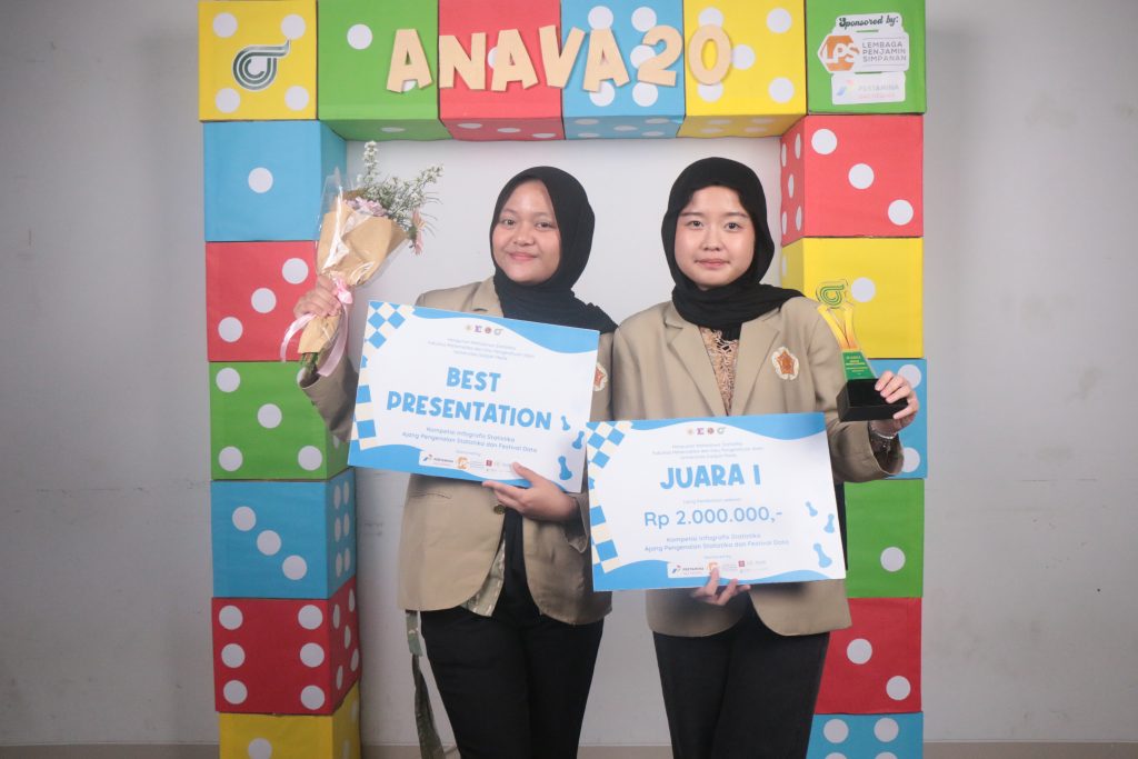
As finalists, we attended the technical meeting on February 9, 2026 and completed the re-registration process as required. From February 9 to 12, we prepared our presentation slides. Each team was given 8 minutes to present and 12 minutes for a Q&A session with the judges. We structured our presentation carefully, starting from the background of the problem, moving through the methodology and findings, and ending with practical implications and data-based recommendations. The final round and awarding ceremony took place on February 14, 2026. During the presentation, we tried to balance analytical depth with clear storytelling. We made sure each visual element was explained step by step so the judges could fully understand the context, process, and meaning behind our infographic. At the end of the event, our team was announced as the 1st Place Winner and also received the Best Presentation award.
This experience reminded us that studying statistics is not only about building accurate models or achieving high performance metrics. The real challenge lies in making insights understandable, relevant, and meaningful to others. ANAVA #20 became a space where critical thinking, creativity, and teamwork came together in a supportive and inspiring environment. From this journey, we learned that data is not just something to analyze, it is something to communicate responsibly.
 Author: Anggita Dwi Putri & Cintya Kusumawardhani
Photo: Anggita Dwi Putri & Cintya Kusumawardhani